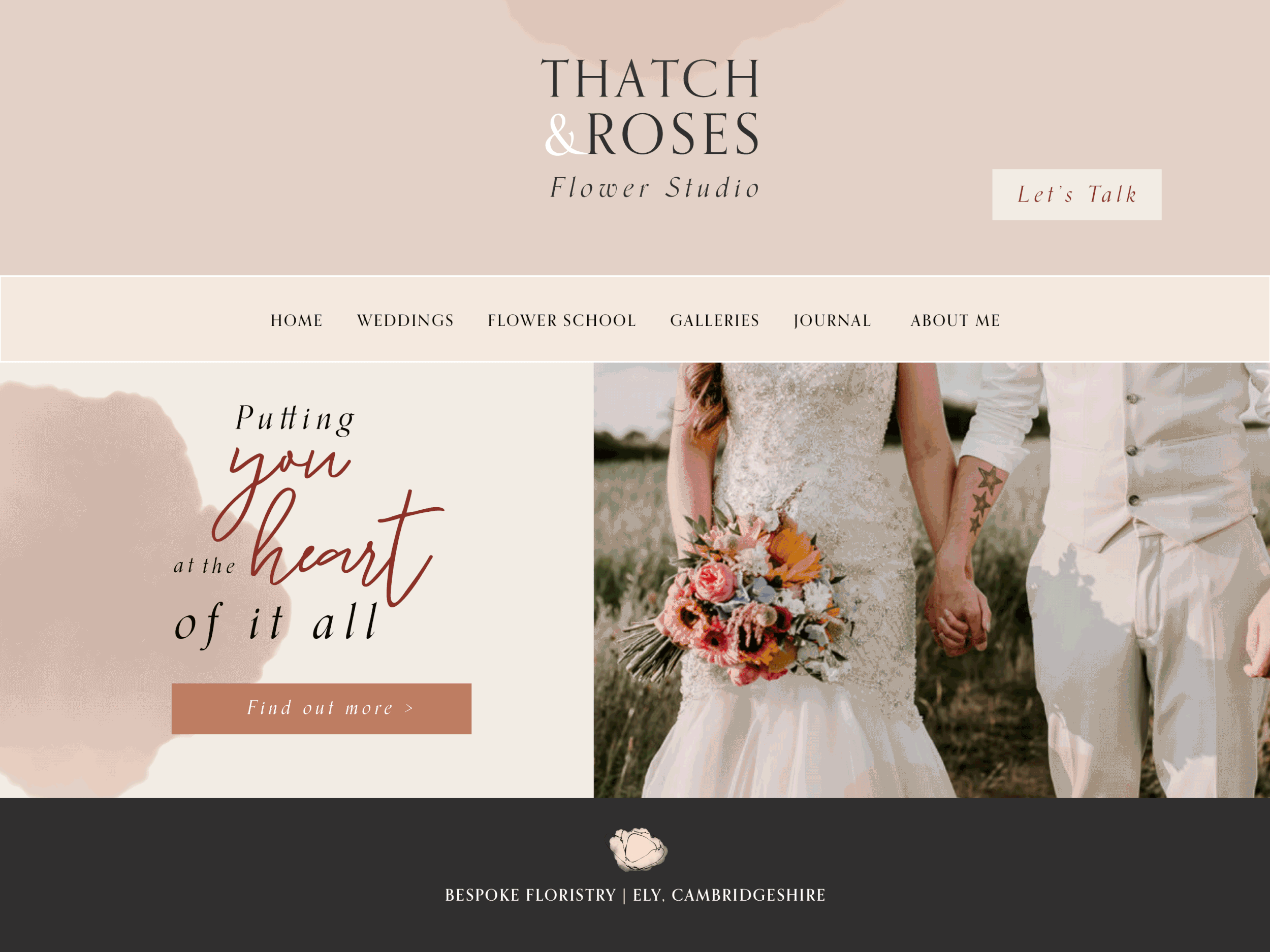
THATCH & ROSES
BrandingFloristry
Thatch & Roses was brought to life by Emily, the visionary and hands-on creative florist. Starting out in a workshop tucked away at the back of the 16th Century thatched farmhouse that Emily shares with her family, “Thatch & Roses” was born.


The brief
Emily felt she needed to rebrand, as her original logo and colour palette was initially DIY’d and didn’t really stand out amongst other businesses in the florist and wedding industries. As her business started to grow, Emily wanted a completely new look that represented her brand values (she prided herself on honest customer service and flowers that symbolise the love of the start of a marriage, not an industry fuelled show for one day). Emily also wanted to attract more of her ideal clients and felt that her original branding wasn’t really doing this successfully.
Emily had pinks in her original colour palette and wanted to keep an element of this, so with our final concept, our colour palette remained with some soft pinks, but we also included a warm rust tone and a deep red, keeping to the romantic theme but we felt this gave a contemporary feel, which was also important to Emily. We wanted to include some floral elements, but not go down the obvious flower illustration route, so I came up with a watercolour petal element, linking to the Emily’s florist roots. We created a soft pattern using these elements, but also used them alone for a romantic, luxury feel. Emily didn’t have any taglines or brand copy so we also assisted with this, which helped build the brand story and give a deeper understanding of what Emily’s customers could expect when they worked with her on their weddings.
Keywords for this brief: Luxury, authentic, heartfelt, passionate, romantic.